

If you’ve ever taken a product photo and thought, “Something feels off, but I don’t know what,” there’s a good chance the problem was the background. The Best Background Color for Product Photography is not always plain white. It depends on your product, your brand, and where the image will appear: online store, Amazon, Instagram, or ads.
The good news? You don’t need a huge studio or expensive gear to make smart background choices. With a bit of strategy, you can use background color to make your products look more professional, more clickable, and more “buyable.”
In this guide, we’ll walk through how to choose the Best Background Color for Product Photography for different types of products, platforms, and brand styles. We’ll also talk about practical setups, common mistakes, and how professional image editing from aitinsider can help you fix backgrounds and keep everything consistent across your catalog.
Why Background Color Matters So Much in Product Photography
Before you start testing colors, it’s important to understand what your background actually does in a product photo. It’s not just “empty space.” The background:
- Directs attention to the product.
- Shapes your brand style and mood.
- Affects how clean and premium the image looks.
- Influences how well the product stands out in feeds and on e-commerce pages.
When you choose the Best Background Color for Product Photography, you are really choosing how the product will be perceived. A bright white background might feel clean and professional, but it can also make very light products disappear. A dark background can look luxurious, but it might not work for platforms that require white or light backgrounds.
Getting this decision right can improve click-through rate, increase conversion, and make your whole store look like it belongs to a serious brand, not a random seller.
What Does “Best” Mean for Background Color?
When people search for the Best Background Color for Product Photography, they usually want a universal answer. But “best” actually depends on three things:
- Your product type and color.
- Your platform rules (like Amazon, Etsy, Shopify theme, or social media).
- Your brand personality.
For example:
- A white ceramic mug on a pure white background might look flat or washed out.
- The same mug on a soft pastel or light grey background might look more defined and premium.
- A black luxury perfume bottle can look incredible on a dark gradient background but might disappear on a crowded social feed if not lit properly.
So the real goal isn’t just to find one Best Background Color for Product Photography that works for everything. It’s to build a small, consistent palette that supports your brand and helps your products stand out in the right places.
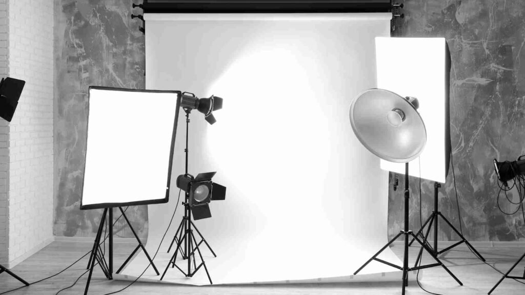
White Background: When It’s the Best Background Color for Product Photography
Let’s start with the classic: white. For many e-commerce platforms, a white or almost white background is the safest and sometimes required choice.
White is usually the Best Background Color for Product Photography when:
- You are selling on Amazon, Walmart, or marketplaces that expect clean product cutouts.
- You want a neutral, distraction-free look that fits any website design.
- You have colorful products that need to pop without competition from the background.
A good white background is not just “a wall” or a wrinkled bedsheet. It should be evenly lit, with minimal shadows, no visible creases, and no weird color cast. If your “white” looks yellow, blue, or grey, it can make your product look cheap.
If you struggle to get a clean white in-camera, this is where professional editing helps. At aitinsider, for example, editors can remove the original background, create a pure white (#FFFFFF) backdrop, and adjust shadows so the product still feels grounded and natural, not like a sticker cut-out.
Light Grey and Off-White: The Underestimated Heroes
Sometimes, the Best Background Color for Product Photography is not pure white but something close: light grey, warm beige, or soft off-white. These tones:
- Add gentle contrast so white or light-colored products don’t disappear.
- Reduce harsh glare and make surfaces look softer.
- Feel modern and minimalist without looking sterile.
If your brand is calm, premium, or Scandinavian-inspired, light neutral backgrounds can be perfect. They allow the product to stay the hero while giving a more editorial, lifestyle feel.
Light grey is especially useful if you often photograph reflective objects (like metal, glass, or glossy plastic), because it helps manage reflections better than bright white.
Colored Backgrounds: When You Want Personality and Scroll-Stopping Power
If your brand is playful, creative, or aimed at younger audiences, bold colors might be your Best Background Color for Product Photography. Think of beauty brands using pastel pinks, streetwear brands using vibrant yellows, or tech accessories on electric blue backgrounds.
Colored backgrounds are most powerful when:
- You’re shooting for social media, especially Instagram and TikTok.
- You want your product to stand out in a fast-scrolling feed.
- You are building a strong, recognizable brand color theme.
However, there are a few rules to keep in mind:
First, make sure the background color doesn’t fight with the product color. For example, a red product on a red background might look muddy unless you’re extremely skilled with lighting and editing. A better approach is to choose a contrasting or complementary color.
Second, keep text and overlays in mind. If you plan to add promo text, price labels, or callouts on top of the image, make sure the background color leaves enough space and contrast for legible text.
Third, test your colors on mobile. What looks nice on a desktop might look too dark or too bright on a phone screen.

Matching Background Color to Product Types
The Best Background Color for Product Photography also depends heavily on the kind of product you’re shooting. Here are some simple, practical guidelines:
Fashion and Apparel
For clothing, neutral backgrounds (white, light grey, beige) generally work best because they allow the fabrics, textures, and fit to stand out. For social media, you can introduce brand colors as accent backgrounds, but for your main e-commerce listing images, stick to clean, neutral tones.
If the clothing is dark, a slightly warm off-white or light grey can create a nice contrast. If the clothing is light (like white T-shirts), consider using light grey or cream instead of pure white so the edges don’t disappear.
Beauty and Cosmetics
Cosmetics are often packaged with strong branding. The Best Background Color for Product Photography in this category often leans towards soft pastels or clean neutrals that reflect the brand’s mood.
For example:
- Minimalist skincare brands often use soft beige, stone, or light grey backgrounds.
- Youthful makeup brands may choose pink, lilac, or mint backgrounds.
You can also combine product colors with background colors that complement the shades (like lipsticks on muted version of the lipstick color family) to create a cohesive, aesthetic grid on social media.
Electronics and Gadgets
Electronics look great on dark or mid-tone neutral backgrounds. Deep grey, charcoal, or gradient backgrounds can give a high-tech, premium feel.
On e-commerce platforms, however, you may still want at least one product image with a white background. So you might use white for the main listing image and darker gradients or colored backgrounds for gallery or lifestyle shots.
Jewelry and Luxury Items
Jewelry often shines on darker backgrounds like deep grey, navy, or even black because these colors highlight reflections and sparkle. However, black is unforgiving; dust, fingerprints, or uneven lighting become very visible.
Sometimes, the Best Background Color for Product Photography in jewelry is actually a textured neutral: soft beige stone, marble, or warm grey, which gives both luxury and softness.

Background Color for E-commerce vs Social Media
You might love one specific background color, but it doesn’t always work everywhere. The Best Background Color for Product Photography can change depending on whether the photo is used on an e-commerce site or on social media.
E-commerce Product Pages
On product pages, backgrounds should support clarity and conversion. That usually means:
- Neutral tones that don’t distract.
- Enough contrast so the product edges are clean.
- Consistency across your product catalog.
Some marketplaces, like Amazon, demand pure white backgrounds for the main product image. For your own website, you have more freedom, but a consistent neutral base is still wise.
If you have multiple product categories, you can assign a slightly different background tone to each category but keep the style consistent. For example, skincare products on warm beige, tech gadgets on light grey, and home décor on off-white.
Social Media and Ads
Social media is where you can push more creative background colors. The goal here is to catch attention, express brand personality, and encourage engagement.
You can:
- Use your brand color as the primary background.
- Play with gradients or blocks of color.
- Mix neutral product shots with bold-colored backgrounds for campaigns and promotions.
Just remember to keep your logo, fonts, and editing style consistent so your content still feels like it’s coming from one recognizable brand.
How Lighting Affects the “Best” Background Color
Even if you pick the Best Background Color for Product Photography, poor lighting can ruin it. Light changes how colors appear: a grey background can look blue, beige can look yellow, and white can look dirty.
Here are a few simple tips:
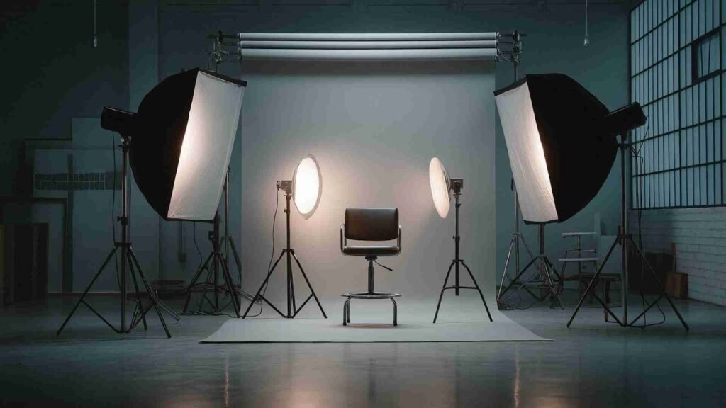
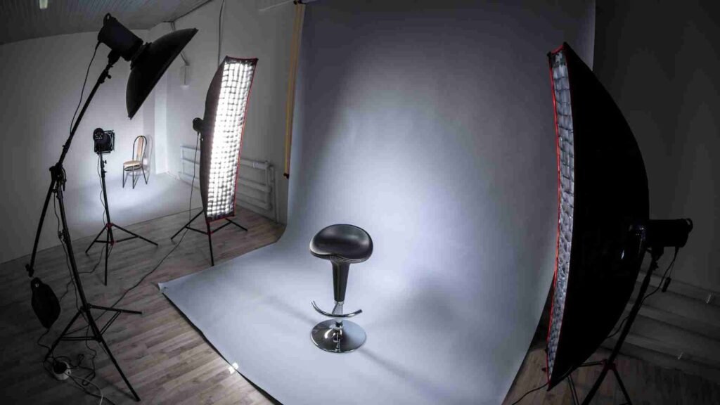
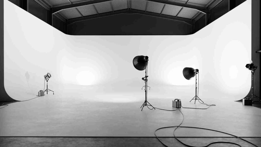
Use soft, even light. You can achieve this with window light and a diffuser (like a white curtain) or with softbox lights. Harsh, direct light will create hard shadows and highlight imperfections in the background.
Watch for color casts. If your room has colored walls or you’re mixing different light sources (like daylight and warm bulbs), your background might take on unwanted colors. Try to stick to one main light source and neutral surroundings when possible.
Check your histogram and white balance. Even basic adjustments in a photo editing tool can help your background look more accurate. And if you’re not confident with editing, services like aitinsider can adjust white balance, correct color casts, and fine-tune backgrounds so they match your brand standards.
Solid Background vs Textured Background
The Best Background Color for Product Photography is not just about the hue but also about texture. You can choose a solid paper, a painted board, a wall, fabric, or styled surfaces like wood, stone, or concrete.
Solid backgrounds are ideal for:
- Marketplace listings
- Catalogs and lookbooks
- Cutout-style images used in banners and ads
Textured backgrounds are great for:
- Lifestyle shots
- Social media content
- Home decor, food, and craft products
For example, a handmade candle might look amazing on a textured stone surface and a soft beige wall, giving it a cozy, artisanal feeling. But for the main product listing, that same candle on a plain off-white background may convert better because the buyer can clearly see the product shape, label, and size.
Building a Simple Background Color System for Your Brand
Instead of guessing every time, it’s smart to create a simple internal system. This will help you consistently choose the Best Background Color for Product Photography across different products and platforms.
You can:
- Choose 1–2 neutral backgrounds for main product photos (for example, white and light grey).
- Choose 1–2 brand colors for social media or campaign shots (for example, pastel pink and warm beige, or deep blue and soft grey).
- Decide which background is used for which purpose (e.g., white for main listing, beige for lifestyle, brand color for social posts).
Write these decisions down and keep a small library of backgrounds in your studio: paper rolls, foam boards, fabric, or vinyl backdrops. That way, you don’t have to rethink the Best Background Color for Product Photography every single time.
If you already have a bunch of mixed images with different backgrounds, a professional editing team can help you unify them. For instance, aitinsider can remove mismatched backgrounds and replace them with your chosen brand color or white, so your product gallery looks clean and consistent.
How to Fix Background Problems with Image Editing
Sometimes your photos are already taken, and reshooting everything is not realistic. That’s where image editing is incredibly useful for controlling background color.
With editing you can:
- Remove messy or distracting backgrounds.
- Change background color to white, grey, or a custom brand color.
- Smooth wrinkles, remove dust or dirt, and clean up shadows.
- Create cutout images with transparent backgrounds for use in different designs.
This means you can rescue decent product photos taken in less-than-perfect conditions and make them look like they were shot in a professional studio.
At aitinsider, we specialize in this kind of work for product and e-commerce sellers. You might have a product shot on a table with clutter behind it; our team can cut out the product, add a clean background, adjust colors, and give you a ready-to-use file for your online store or social media campaign.
Common Mistakes When Choosing Background Color
Even with the Best Background Color for Product Photography, there are some common traps that many beginners fall into:
Using busy patterns.
Patterns can easily compete with the product, making it hard for the viewer to focus. It is usually better to keep backgrounds simple and let styling details come from props rather than from the background surface itself.
Low contrast between product and background.
A light product on a light background, or a dark product on a dark background, can lack separation. This doesn’t mean you can’t do “tone-on-tone” photography, but it requires good lighting and careful editing to maintain clarity.
Too many background colors at once.
If every product has a different background color, your store can look chaotic. Try to limit your palette and keep a consistent look across product categories.
Ignoring platform guidelines.
You might fall in love with a creative background for your photos but forget that certain marketplaces require white or specific backgrounds. Always double-check the requirements before finalizing your main product images.
How to Test the Best Background Color for Product Photography
You don’t need to guess forever. You can test background colors in a simple, practical way:
Take a few key products and photograph them on different backgrounds: white, light grey, brand color, and maybe one textured neutral. Then:
- Upload each version to your website (even in a hidden test page).
- Look at them on desktop and mobile.
- Check which version feels more “clickable,” clear, and on-brand.
You can also run A/B tests, where one product listing uses one background and another version uses a different background, and compare click-through or conversion over time. If you don’t have the time or tools to run full A/B tests, just ask a few people from your audience which image they would be more likely to click or buy from.
If you plan multiple tests and variations, a service like aitinsider can help you quickly generate multiple background options from a single base photo. That way, you can experiment with the Best Background Color for Product Photography without reshooting everything from scratch.
Bringing It All Together: Choosing Backgrounds with Confidence
By now you’ve probably realized there isn’t just one Best Background Color for Product Photography that fits every brand and product. Instead, you should think in terms of a small set of go-to options that align with your products, your brand, and your platforms.
In summary:
- Use white or near-white backgrounds for maximum versatility, especially for e-commerce listings and platforms that require clean product cutouts.
- Use light grey, off-white, or beige backgrounds when you want softer contrast, more depth, and a modern, premium feel.
- Use brand-colored or bold backgrounds for social media, campaigns, and attention-grabbing visuals that express personality.
- Adjust your background choices based on product type: fashion, beauty, electronics, and jewelry all respond differently to color and contrast.
- Keep lighting consistent and fix color casts through editing so your backgrounds look intentional, not accidental.
- Build a simple internal system, so you always know which background to use where.
If you keep these points in mind, you’ll be much more confident every time you choose a surface or roll down a backdrop. You’ll start to see that the Best Background Color for Product Photography is really about clarity, brand consistency, and emotional impact on the viewer.

How aitinsider Can Help You with Backgrounds and Image Editing
Choosing and shooting the right background is one part of the process. Polishing the final image is another. That is where professional image editing makes your life easier and your brand stronger.
At aitinsider, we provide specialized Image Editing services for product photographers, e-commerce brands, and online sellers. If you:
- Have decent product shots but messy or inconsistent backgrounds,
- Need all your product photos converted to clean white or a specific brand color,
- Want to test different background colors without reshooting, or
- Need a consistent, premium look across your whole catalog,
our team can help.
You can visit aitinsider to learn more about our services, see examples, and reach out about your specific needs. Whether you’re launching your first small store or managing a large product catalog, we can become your behind-the-scenes editing partner.
By combining smart background choices in your photos with professional editing from aitinsider, you’ll be much closer to truly having the Best Background Color for Product Photography in every image you publish-for both e-commerce and social media.