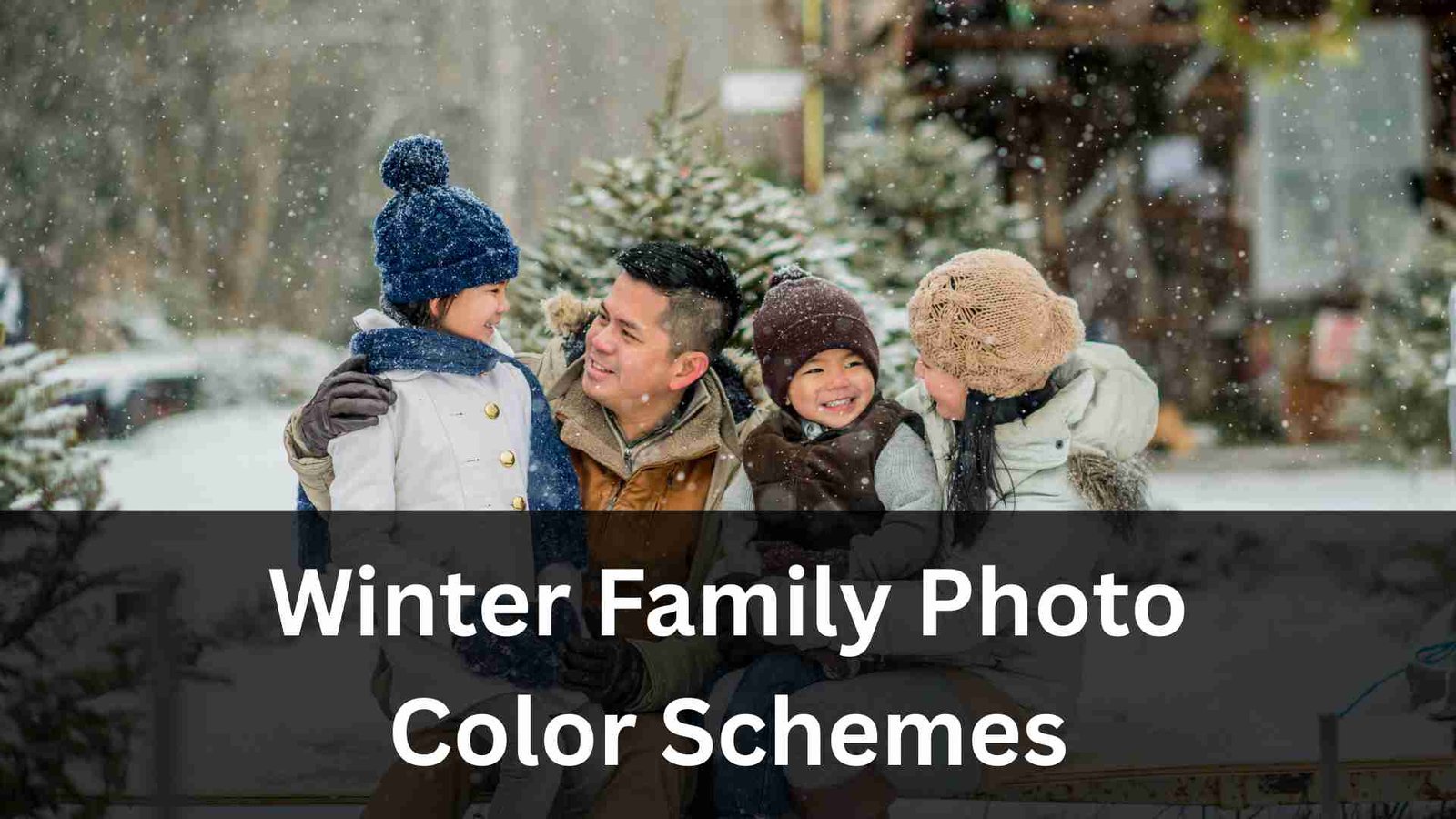
Winter photoshoots are some of the most magical moments of the year, and choosing the right colors can make them look even more stunning. Whether you’re planning a cozy indoor session, snowy outdoor shoot, or festive holiday portrait, the color palette you choose plays a huge role in how warm, elegant, or joyful your final images will feel. That’s why so many families search for the best winter family photo color schemes-because the right colors instantly elevate your photos, highlight everyone’s features, and bring harmony to every shot.
In 2025, winter color trends are all about softness, natural tones, warm neutrals, and deep, rich holiday shades. Families are choosing color schemes that feel timeless yet modern-tones that blend beautifully with snowy backgrounds, twinkling holiday lights, and rustic indoor settings. With the right palette, your family photos can look polished, coordinated, and naturally stylish without feeling too “matchy-matchy.”
In this guide, we’re breaking down the Top 20 Winter Family Photo Color Schemes for 2025 Holiday Portraits. You’ll get inspiration for every type of shoot-luxurious, cozy, classic, bold, muted, modern, and festive. If you’re planning your wardrobe, you’ll find plenty of combination ideas that are flattering, easy to pull together, and perfect for winter scenery.
We’ll also guide you through what works best with snowy landscapes, what colors pop against evergreens, how to blend neutrals with accents, and how to create a consistent look even with a large family group. And if you ever need professional help editing your winter photos, color-correcting your outfits, or enhancing your backgrounds, aitinsider offers complete Image Editing Services to give your portraits that final polished look.
Choosing the right winter family photo color schemes helps your entire photoshoot feel cohesive and visually balanced. Winter backgrounds-snow, pine trees, twinkle lights, indoor fireplaces-can either complement or compete with your clothing. When you choose colors intentionally, your family becomes the natural focus of every image.
Winter colors also affect:
The best winter family photo color schemes are flexible, comfortable, and easy to coordinate across adults, teens, and children without needing matching outfits. Let’s explore the top trending palettes for 2025.
One of the most loved winter family photo color schemes of 2025 is the neutral cream palette. Shades like ivory, oatmeal, light beige, and soft white create a dreamy, cozy, and elegant look-especially for snowy outdoor shoots.
This palette works beautifully because the neutrals blend smoothly without overpowering the natural winter scenery. You can mix textures like wool, knit sweaters, faux fur, corduroy, and linen to add depth. Against snow, these tones create a clean, timeless, and airy feeling that looks professional with very little effort.
Forest green is trending heavily in 2025 family portraits, especially for winter. Paired with cream and brown, the combination feels natural, earthy, and warm-perfect for outdoor wooded locations.
This color scheme photographs incredibly well because the deep green adds richness, cream balances brightness, and brown provides grounding tones. It’s also great for matching different clothing styles: sweaters, boots, cardigans, scarves, and coats all fit beautifully into this palette.
If you want something modern yet classic, navy blue mixed with gray and camel is a sophisticated choice. The deep blue adds elegance, gray keeps things soft, and camel warms the overall palette.
This is one of the most flattering winter family photo color schemes because navy and camel complement all skin tones. Whether you’re shooting indoors near a fireplace or outdoors against evergreens, the contrast is just right-rich but not too bold.

For families that want a bold, festive holiday look, burgundy is a perfect winter favorite. Paired with black and subtle gold accents, the outfits look elevated and luxurious.
This combination is perfect for formal family portraits, Christmas tree farm photos, or holiday card sessions. The richness of burgundy pops beautifully against snowy backgrounds, while black adds depth and gold adds a touch of warmth.
Dusty blue is a soft, calming winter tone that creates a magical, frozen-inspired look in photos. When paired with white and silver, the palette feels icy, crisp, and elegant.
This color scheme is ideal for families who want a light, airy winter aesthetic rather than something warm or festive. The tones reflect light beautifully, especially during golden hour.
For a rustic winter feel, brown, olive, and mustard create a warm earth-tone palette that looks natural and stylish. These colors blend especially well for forest shoots, barn locations, and outdoor woodsy vibes.
Because brown and olive are grounding shades, mustard adds just enough brightness without stealing all the attention.
A simple yet timeless trio-black, white, and plaid-always photographs beautifully in winter. You can incorporate plaid through scarves, jackets, skirts, or accessories to create visual interest without overwhelming the shot.
This combination works for formal and casual shoots, and it’s perfect for large family groups because it’s easy for everyone to coordinate around.
If you want something gentle and romantic, blush pink is the perfect winter pastel. Paired with cream and soft gray, the color scheme feels dreamy and feminine.
This palette is wonderful for snowy sessions, as the pink stands out subtly while still blending naturally with winter landscapes.
One of the most elegant winter family photo color schemes for 2025 is emerald green with black and champagne. This palette works especially well for formal family portraits, matching dresses and suits, and holiday events.
The deep green adds richness, champagne adds glow, and black anchors the combination. It’s a polished and sophisticated palette that feels expensive in photos.
For a clean and modern winter aesthetic, charcoal mixed with lighter grays and white creates a sleek monochromatic palette. It’s perfect for minimalist indoor shoots or snowy forest sessions.
This palette gives a balanced contrast that works well in both bright and dark environments.
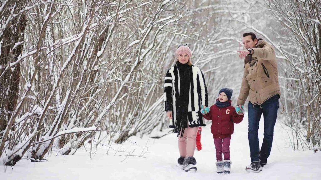
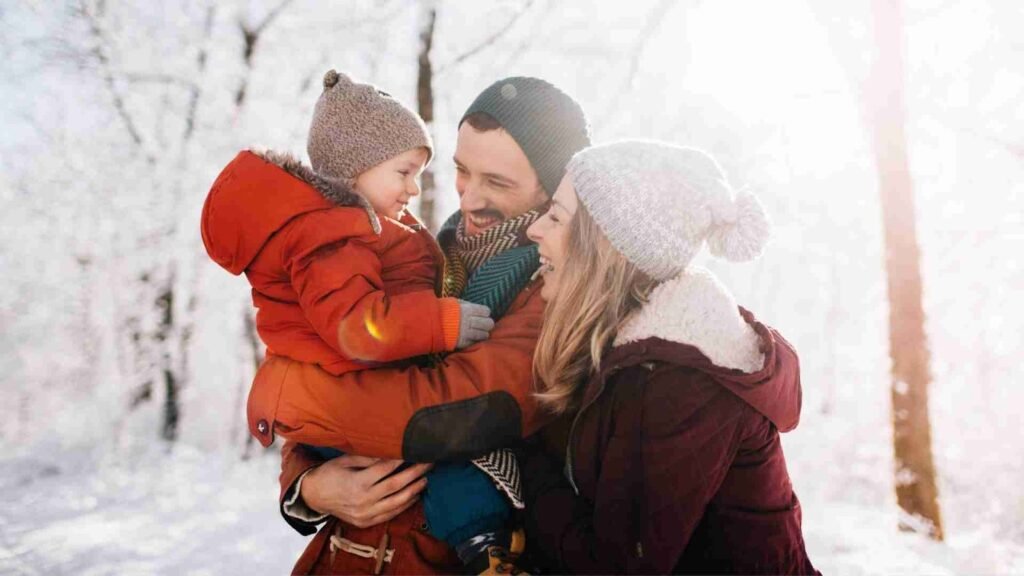
Deep red always returns as a winter favorite, and in 2025 it continues to be one of the most classic winter family photo color schemes. When paired with cream and brown, it creates a cozy, festive, and warm holiday look. This palette works beautifully for Christmas card photos, snowy forest scenes, or rustic cabin backdrops.
The richness of the red offers just the right amount of visual pop without being too bright, while cream keeps everything soft and neutral. Brown tones-like boots, belts, coats, or sweaters-tie the palette together, making it feel grounded and cohesive. This combination looks especially stunning during early morning or late afternoon winter sunlight.
Sage green has become one of the most popular colors across all photography styles, and for winter 2025 it’s trending even more. When paired with ivory and tan, the palette becomes earthy, soft, and incredibly photogenic.
This color trio works well for outdoor photoshoots in snowy fields or woodland areas. The muted tone of sage blends beautifully with winter landscapes, and ivory adds brightness that feels gentle rather than harsh. Tan pieces-like knit sweaters or suede boots-give a natural warmth that complements the rest of the colors perfectly.
For families wanting a warm, autumn-inspired winter look, rust and burnt orange are wonderful choices. These tones add warmth and depth to winter scenes, especially when snow is present. Cream or soft white balances the palette and keeps it from feeling too bold.
This combination is perfect for families who prefer earthy, cozy vibes with a modern twist. Rust sweaters, burnt orange cardigans, and cream accessories look fantastic together, especially with textured fabrics like wool or cable-knit patterns.
Champagne is a glamorous color that photographs beautifully in winter settings. Combined with white and metallic gold or silver accents, this palette creates a luxurious, soft, glowing look that feels perfect for holiday portraits.
This color scheme works well for indoor sessions with elegant backgrounds-such as decorated Christmas trees, fireplaces, or modern living rooms. For outdoor shoots, champagne tones add a subtle warmth that contrasts beautifully against snow or darker winter landscapes.
Teal adds a unique pop of color without being too overpowering. Paired with navy and gray, it becomes a rich and balanced color palette that works beautifully for families who want something different from traditional holiday colors.
Teal brings energy, navy adds depth, and gray softens the entire look. This combination is great for both casual and formal photoshoots, making it a versatile choice for 2025 family portraits.
Soft pink tones like mauve and dusty rose create a romantic, elegant winter palette that looks timeless in photos. These colors pair naturally with cream, creating a dreamy, pastel winter aesthetic.
If you’re shooting in a snowy environment, these tones will stand out gently without clashing. The color scheme is ideal for families who prefer soft, feminine, modern looks.
This combination is earthy, bold, and stylish. The richness of forest green, paired with the grounding effect of brown leather accessories, makes this palette feel strong and cohesive. Black pieces add structure and elegance.
This palette works particularly well for men’s outfits-green jackets, black jeans, brown boots-and blends seamlessly with neutral or wintery backgrounds. It’s also a great option for layered outfits with coats, scarves, and vests.
Slate blue is softer than navy but richer than pastel blue, making it a perfect winter color. Combined with khaki and white, this palette feels fresh, calm, and modern. It’s ideal for families who want a natural, slightly coastal-inspired winter look.
Khaki adds warmth to balance the coolness of slate blue, and white brightens everything up, creating a photo-friendly combination that works well in both indoor and outdoor settings.
Maroon is a deeper, moodier version of red, and it’s perfect for families who want a dramatic yet elegant winter aesthetic. Paired with gray and black, it becomes a sophisticated palette that looks great on everyone.
The colors have a high contrast without feeling overwhelming, and they photograph beautifully against dark green trees, city streets, or snowy backgrounds. This palette is also very easy to coordinate for large groups.
This color scheme blends natural earth tones with a deeper shade for balance. Beige keeps things soft, olive adds a natural wintery green element, and charcoal provides depth.
This palette is perfect for outdoor forest or mountain shoots. Because each color is muted, the overall effect is harmonious and timeless. It’s especially flattering for lifestyle winter photoshoots where families want a relaxed, neutral-toned wardrobe.
Finding the right palette from these winter family photo color schemes starts with thinking about your photoshoot location, lighting, and style. Snowy locations work best with bold or warm colors, while forest settings pair beautifully with earth tones and neutrals. Indoor shoots with Christmas decorations usually look best with classic holiday colors like red, green, gold, and cream.
Consider these tips when picking your color scheme:
Your surroundings influence how your colors appear. For example, white snow reflects light well, so pastel or muted colors look dreamy. Deep green forests bring out warm and earthy tones.
This makes coordination easier for large families and ensures a balanced palette.
Cable-knit sweaters, wool coats, denim, leather boots, and soft scarves add dimension without making the outfits look too busy.
These tones don’t photograph well in winter lighting and can reflect onto skin in unflattering ways.
Once you’ve chosen a palette, coordinating outfits becomes simple. Start with the main color-like burgundy, navy, emerald, or cream-and let one or two family members wear it as the highlight tone. Others can wear softer or neutral shades from your palette.
Layering is especially effective for winter photos because it adds depth. Cardigans, jackets, scarves, boots, and hats not only keep everyone warm but also enhance the color coordination.
For example, in a navy, gray, and camel palette:
When you stay within a palette, everything looks naturally harmonious without appearing too matched.
Even with perfect winter family photo color schemes, winter lighting can be tricky. Snow can cause overexposure, shadows can darken faces, and holiday lights can create inconsistent color tones.
This is where proper editing makes a huge difference.
Professional editors can:
If you want your winter portraits to look polished, professional, and consistent, aitinsider offers complete Image Editing services to help your photos look their absolute best. Whether it’s color correction, background cleanup, or overall enhancement, our team ensures your final images match your vision perfectly.